Art Direction Project
Logo, Identity, Exhibit Posters, and Exhibit Booklet
 The State of Detroit Logo |  Exhibit Poster 1 |
|---|---|
 Exhibit Poster 2 |  Exhibit Poster 3 |
 Exhibit PosterDetail |  Exhibit Poster 2Detail |
 Exhibit Poster 3Detail |  Exhibition BookletFront Cover |
 Exhibition BookletFirst Page |  Exhibition BookletAbout Exhibit Spread |
 Exhibition BookletTable of Contents |  Exhibition Booklet |
 Exhibition Booklet |  Exhibition Booklet |
 Exhibition Booklet |  Exhibition Booklet |
 Exhibition Booklet |  Exhibition BookletBack Cover |
Process Work and Style Guide
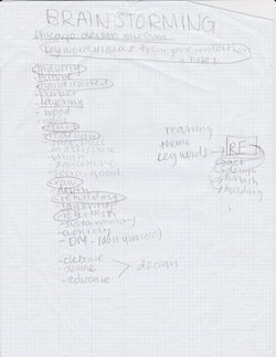 Brainstorming ListI began to reflect on my research, and notes from Chicago Design Museum presentation and listed words that I thought formed the exhibit's identity. | 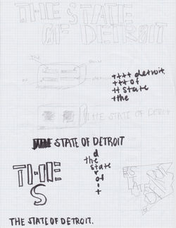 Visual Brain DumpThis part of the process helped me translate key concepts (re-use of raw materials, re-building, construction, community revival) into visual form. |
|---|---|
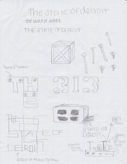 Visual Brain DumpConstruction and building blocks suddenly became reoccurring themes throughout my sketches. | 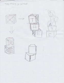 Logo Sketches |
 Logo Sketches | 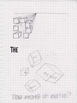 Poster SketchesIn my exhibit posters I wanted to use the block shape as an element that connects to the logo. |
 Poster Sketches |  Poster Sketches |
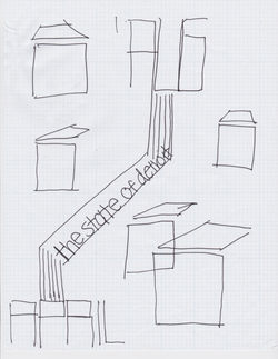 Poster Sketches | 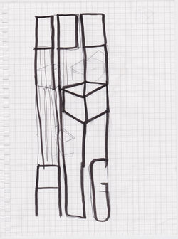 Poster Sketches |
 Poster Sketches | 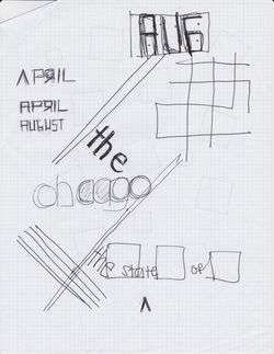 Poster Sketches |
 Poster Computer Sketches |  Identity Guide PlanningI chose a Red, Black and White palette in order to reference the constructivist style. I also began experimenting with thick, geometric san-serif typefaces to convey a sense of progress and strength. |
 Style GuideLogo on Black |  Style GuideLogo on Red |
 Style GuideColor Pallette |  Style GuideMain Typeface |
 Style GuideType Styles |  Style GuideType Styles |
 Style GuidePoster Paper Guide and Colors |
State of Detroit Exhibit Identity for Chicago Design Museum
When looking at the state of Detroit exhibit, what do you see? Through the Chicago Design Museum lens you see maker-spaces, urban agriculture, rebuilding, and the reuse of raw materials. Ultimately you see people in Detroit bringing ideas together to construct a social good. And even more, they are unconsciously using design process thinking to execute these ideas.
When I was sketching, I kept moving towards the idea of construction and building blocks. I began to draft up a plan to reference constructivism through my designs for this project. The constructivist movement, originated in Soviet Russia, favored art as a practice directed towards social change or serving a social purpose, which relates to the themes presented in the exhibit. I also wanted to touch on bauhaus, and it’s emphasis on experimentation and problem solving, which is also very much what we see in happening in Detroit.
The red blocks in my design are meant to symbolize material, which in this case would be the “building blocks” to social change. The block is used as a key element and acts as a repeating motif that unifies all the pieces of the project. In the logo the blocks are positioned in a way that they are toggling above and below the text. This is to convey movement, and shifting of concepts and ideas. The exhibit title is centered across the same baseline, suggesting the sometimes static nature of Detroit. The “e” in each word is positioned in the negative space in between the boxes, which is meant to represent the way the exhibit curation makes connections between the concepts that have been presented in this exhibit.
I used a simple red, white and black palette for the exhibit's identity to touch on the constructivist design style. I used different variations of Futura as my main and only typeface. I choose Futura because I thought it was a good contemporary, thick, san-serif typeface that would communicate the notion of stability, and community revival.
The exhibit poster series is meant to draw viewers in with the use of playful type treatment. It was important for me to limit the use of materials in the poster designs, in order to mimic the "reuse of raw materials" theme of the Exhibit. Each poster places different emphasis on a key piece of information about the exhibit: The exhibit name, the location of the exhibit, and the time period the exhibit will be up.
The exhibit booklet was a great opportunity to integrate "design process thinking" themes from the exhibit. The block reappears in each chapter of the book, but it displayed as going through a process: Starting from rough outlines, progressing into it's full form. Each chapter is strategically named after words beginning with "Re." After revisiting my brainstorm list that I developed from my research, I noticed words like "redesign, research, rebuild, remake, react, refurbish" were reoccurring and were consistent with themes of design process and the curatorial content about Detroit.